
Supernova Electric is a real Austin-based electrical company known for its bold service and reliable reputation. This was a conceptual redesign where I served as the Visual Designer, reimagining the brand's identity and digital presence to better reflect its energetic, dependable nature.

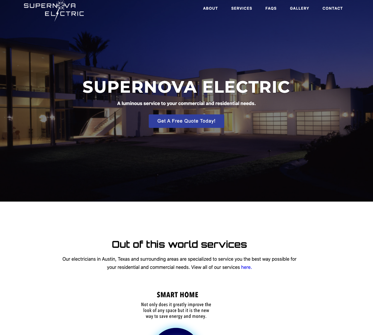
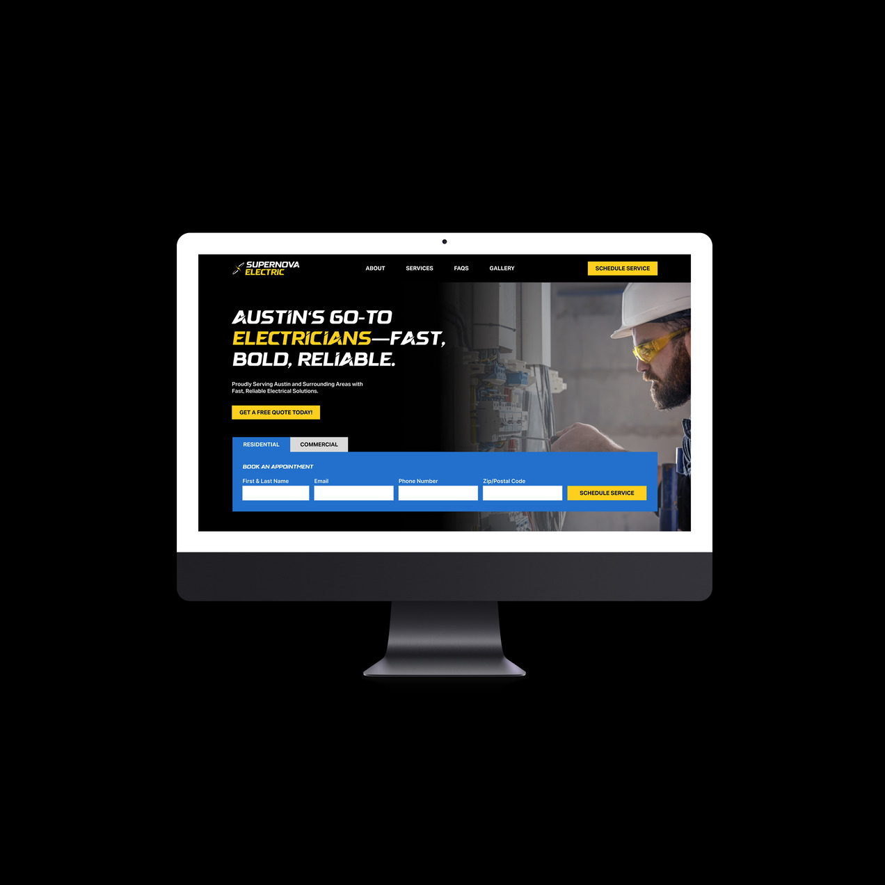
The goal was to elevate their existing branding with a more modern, confident aesthetic—one that would stand out in a competitive service-based industry and resonate with Austin's fast-paced, growing market. From landing page mockups to branded gear, the visuals needed to express power, trust, and precision.
To modernize Supernova Electric's identity, I began by researching visual trends in the construction and service industries. I wanted the branding to feel bold and energetic—something that communicated strength and reliability while also feeling fresh and professional.
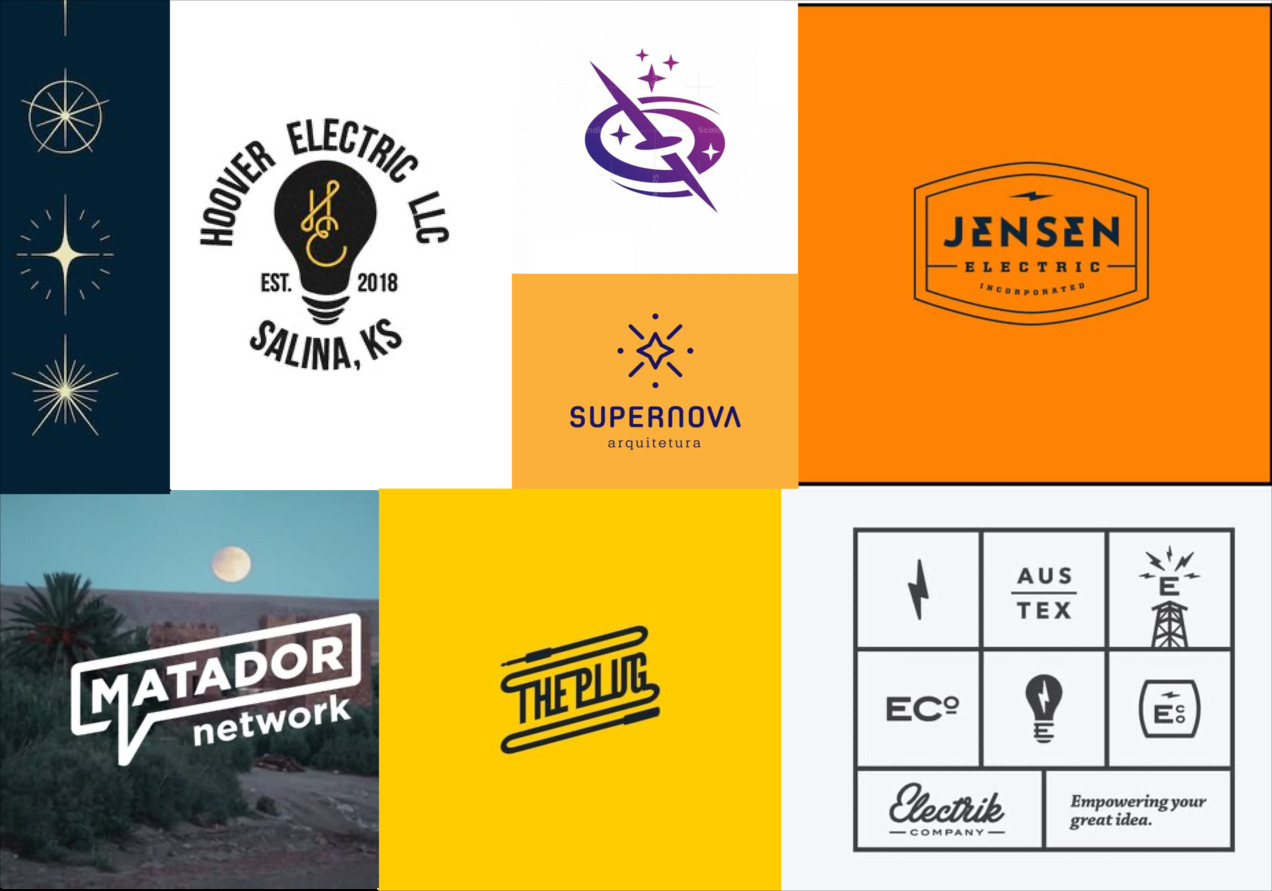
I explored multiple directions for the brand identity, focusing on:

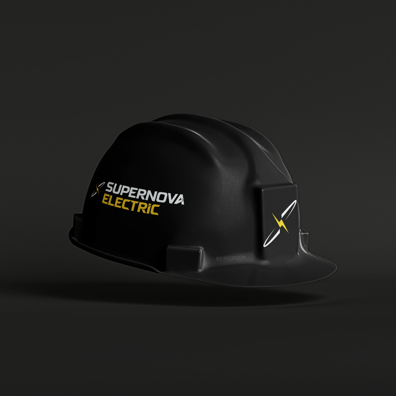
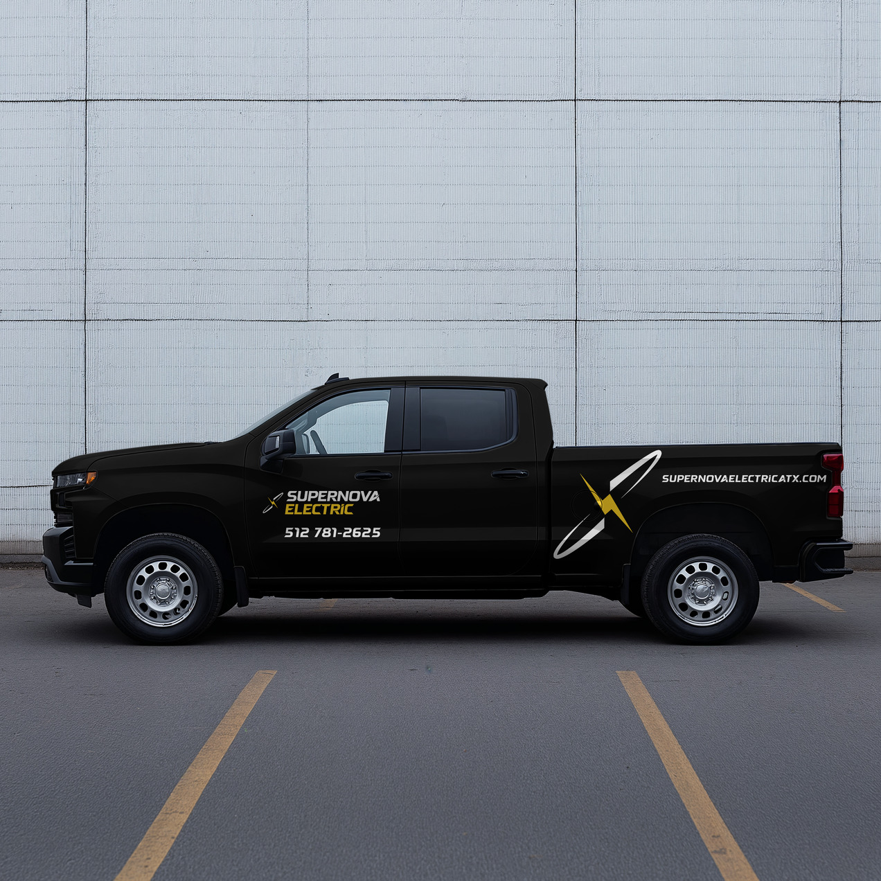
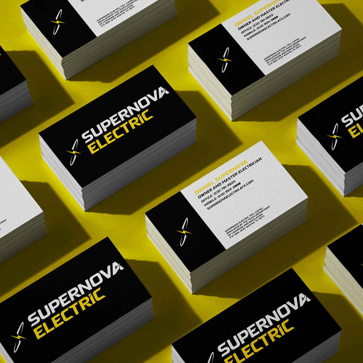
The final design system captures the energetic, reliable nature of Supernova Electric while maintaining a professional and modern aesthetic. The branding system was developed to work across both digital and physical applications.
The color palette was chosen to reflect Supernova Electric's core values: energy, reliability, and professionalism. The high-contrast combination ensures visibility and impact across all applications.

I selected a strong, industrial typeface that conveys power and reliability while maintaining excellent readability across all applications.

This project taught me how to blend bold visual storytelling with practical design thinking. Working on a real business pushed me to consider not just aesthetics, but also clarity, function, and how design can directly impact a company's ability to connect with clients.
Through this conceptual redesign, I gained experience designing for a service-based industry—where trust, speed, and professionalism must come across at first glance. I learned how to create a consistent brand system that could adapt to both digital and physical applications, from a website to uniforms and gear.
Ultimately, this project reminded me that strong design isn't just about standing out—it's about creating a look and feel that aligns with a company's values and helps them grow.