Verde Grill is a concept redesign of a food truck website I had originally created for Greens 'n Grill. While the initial project focused on web design, I saw an opportunity to take it further—to give the brand a full makeover from the ground up.
This redesign includes not just the website, but a complete rebrand—from logo and color palette to typography and tone of voice. My goal was to craft a cohesive, modern identity that feels fresh, vibrant, and rooted in community.
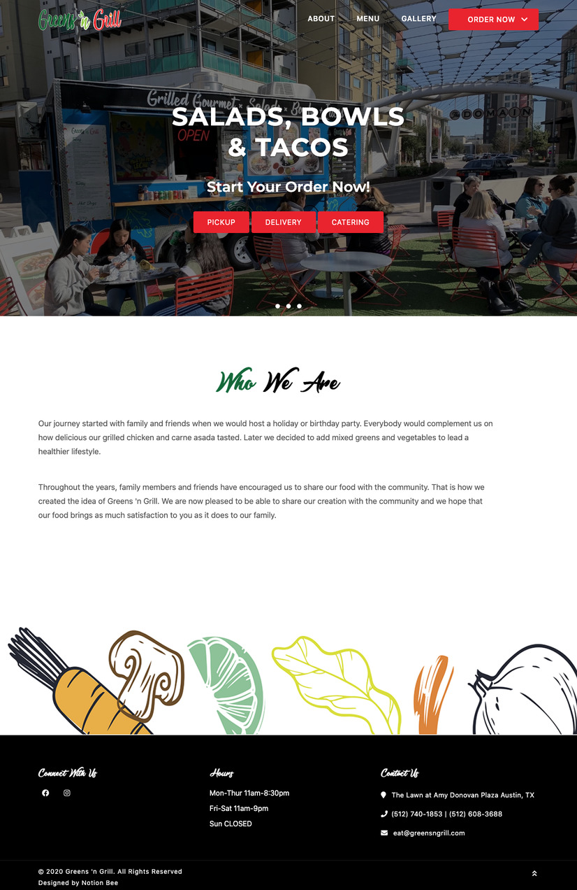
When I first encountered Greens 'n Grill, I saw a food truck with heart—but not a clear identity. The website felt dated and lacked the vibrancy, freshness, and professionalism that matched the food being served. It had:
While brainstorming ideas, one question sparked everything:
What if Whole Foods had a Mexican food truck?
That one thought shifted my entire approach. I imagined a brand that felt fresh, organic, modern, and deeply rooted in Mexican flavors. Something that could live comfortably in the heart of Austin but still stand out in a crowd of food trucks. From that idea, Verde Grill was born—a new name, a new look, and a whole new experience.
My mission was to create a clean, bold, and approachable identity that matched the truck’s culinary values while also improving usability and visual impact.
Before developing the visual identity for Verde Grill, I immersed myself in sources of inspiration that would reflect the brand's core values of health, culture, and freshness:
Organic Lifestyle & Health Food Trends: I researched modern food brands focused on clean eating and sustainability to better understand how visual design communicates health and trust.
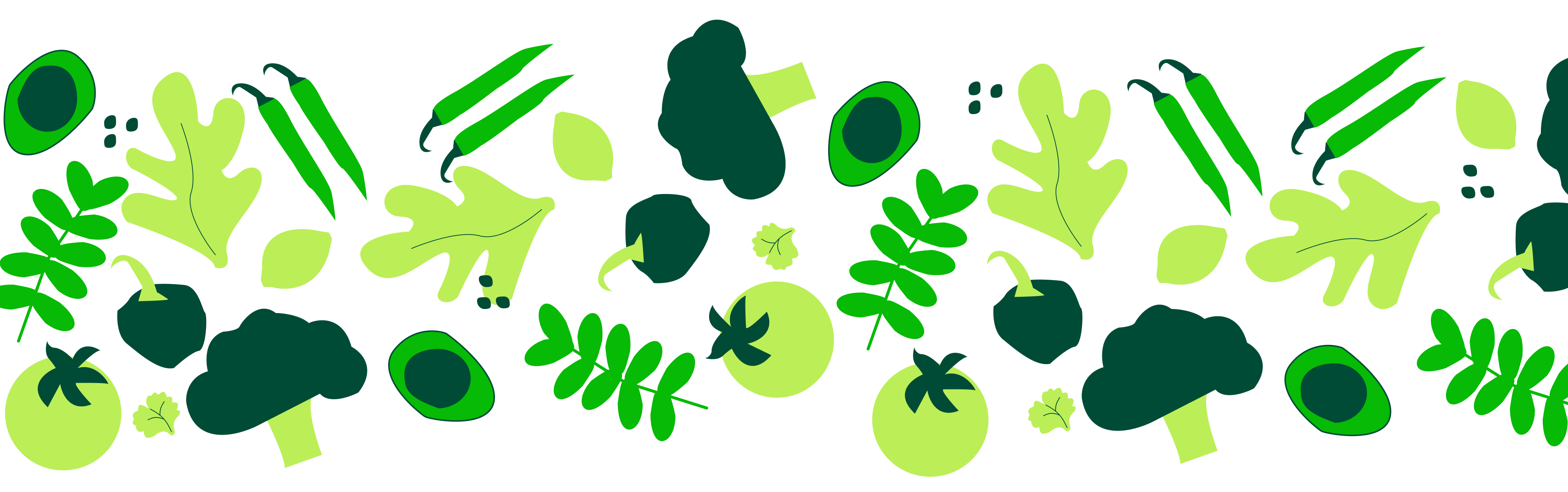
Mexican Culture & Cuisine: I pulled from traditional Mexican color palettes and food visuals—bright greens and fresh ingredients—to celebrate the roots of the cuisine in a bold, modern way.
Austin's Food Truck Scene: I studied local competitors and street food aesthetics to make sure Verde Grill stood out with a clean, inviting, and approachable design system.

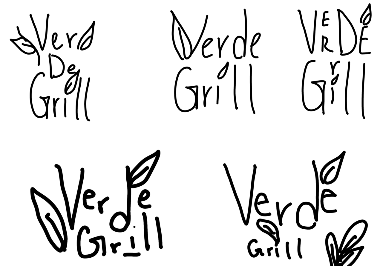
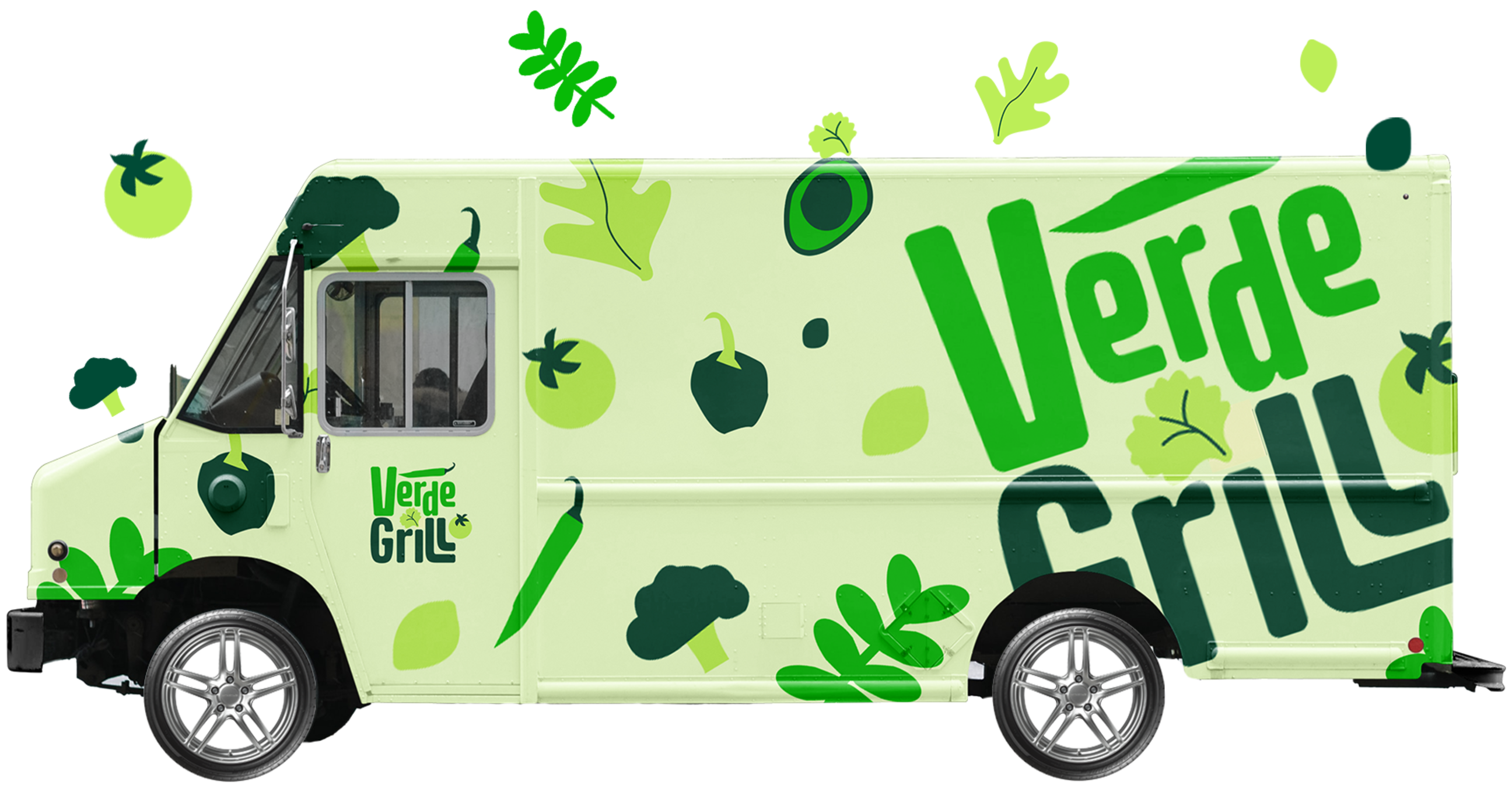
In the early stages of ideation, I was drawn to natural elements and began sketching logo concepts that incorporated leaves to highlight the organic, veggie-forward focus of the brand. I experimented with different leaf shapes—some stylized and minimal, others more hand-drawn and playful—to see what felt the most authentic.
At the same time, I explored various typographic layouts for the name "Verde Grill." I played with letter positioning, stacking, and spacing to find a balance between personality and clarity. Some sketches leaned more rustic, while others had a clean, modern structure.
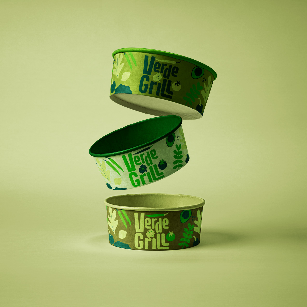
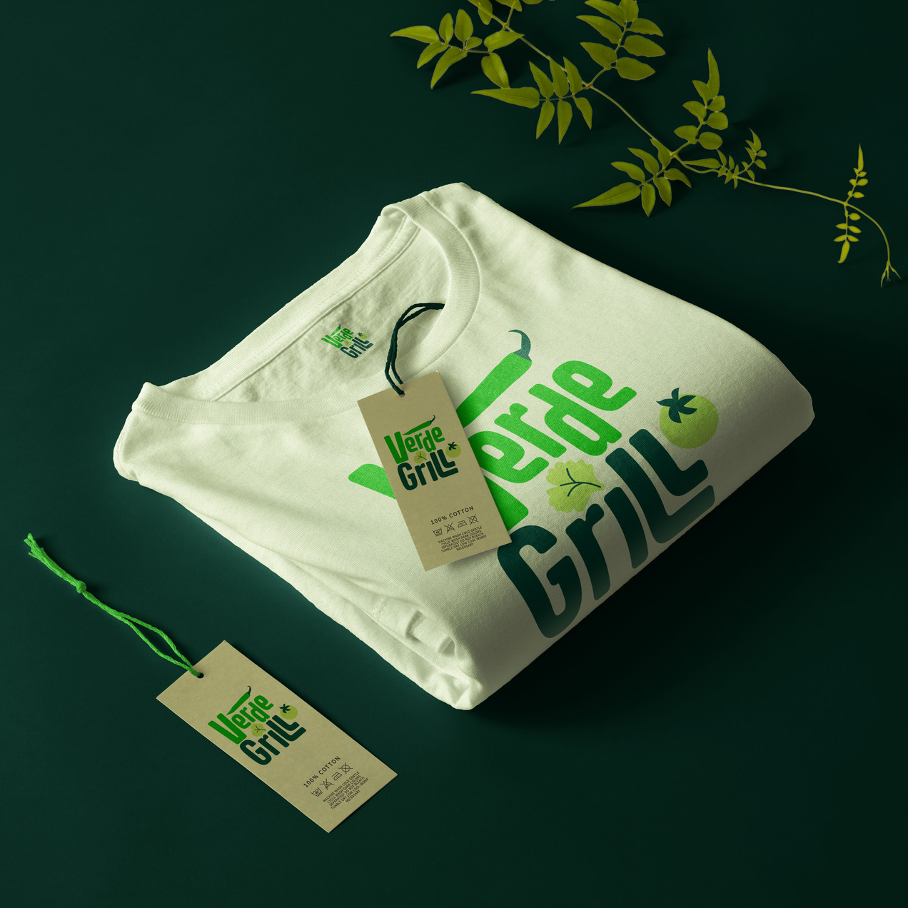
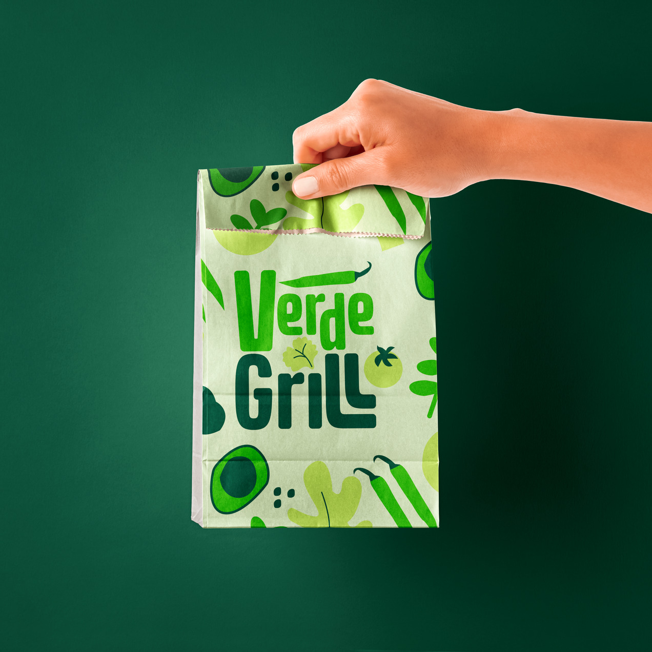
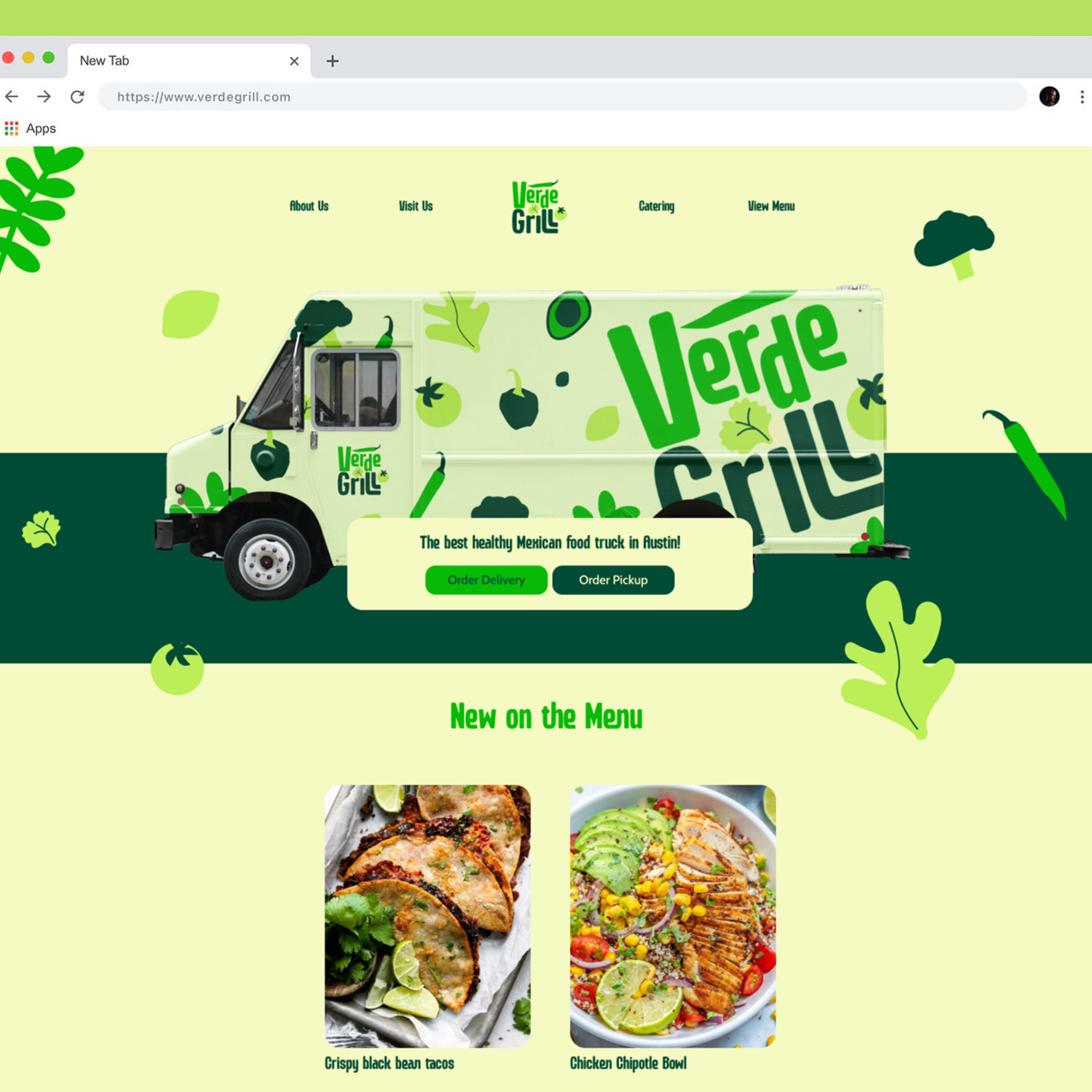
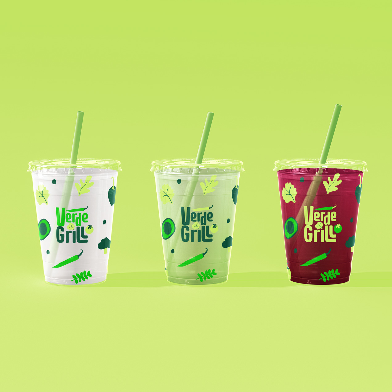
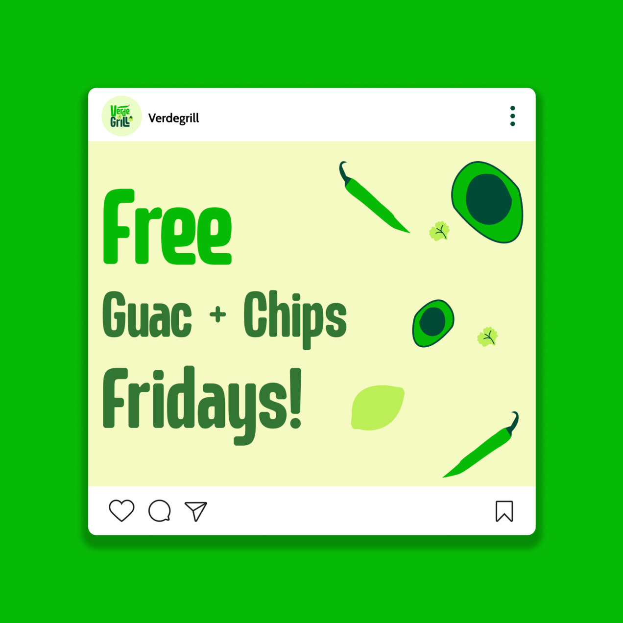
Selected a color palette of lime green and dark green to convey organic, natural, and vibrant qualities.

Used a clean, modern sans-serif typeface to reflect the brand's fresh, minimalist aesthetic.

I wanted to create custom illustrations to make sure they were up to brand standards.
Working on Verde Grill's brand design was a rewarding journey that taught me the importance of balance between playfulness and professionalism. My initial inspiration—combining the organic, fresh vibe of Whole Foods with the bold, flavorful nature of Mexican cuisine—guided every design decision, but the process also revealed how crucial it is to stay adaptable.
One of the biggest challenges was ensuring the illustrations felt authentic and didn't overwhelm the simplicity of the wordmark. I had to experiment with different styles to find the right level of detail that would complement, rather than compete with, the clean typography. The result—a sleek sans-serif logo with three well-placed illustrations—strikes that balance perfectly.
Overall, I'm proud of how the final design communicates the essence of Verde Grill: fresh, vibrant, and rooted in the flavors of authentic Mexican food. This project strengthened my ability to merge visual aesthetics with a brand's values, and I'm excited to see how this identity will resonate with Verde Grill's audience.