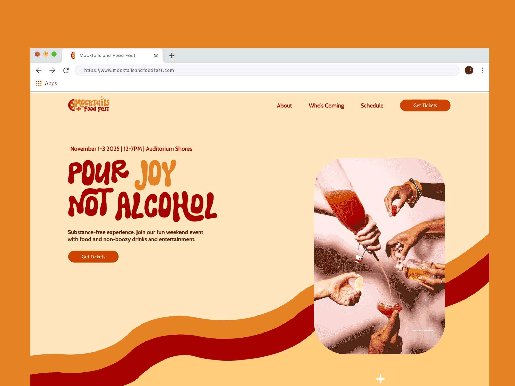
Mocktails & Food Fest is a concept festival imagined for Austin—a city known for its vibrant food scene and eclectic culture. This three-day event brings together the best of gourmet cuisine and creative, alcohol-free beverages, celebrating flavor, inclusivity, and mindful enjoyment.
Originally envisioned with a more traditional approach, I decided to redirect the brand vibe to feel more fun, fresh, and experimental— capturing the spirit of Austin while appealing to a younger, health-conscious crowd.
From the visual identity to the event's tone and experience, the Mocktails & Food Fest concept reimagines what a modern food festival can be— bold, flavorful, and buzz-free.
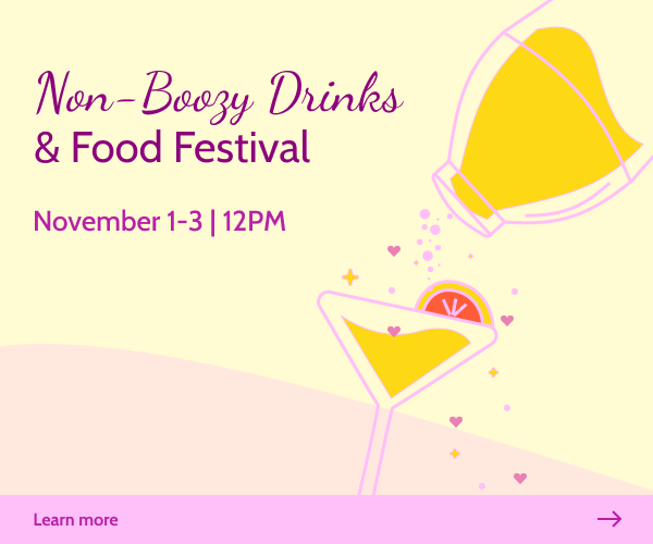
The original concept for this project, titled Non-Boozy Drinks & Food Festival, had a playful and cheerful tone, but lacked the brand depth and cohesion I knew it could have. While the idea was strong, the identity needed refinement—from the color palette and typography to the name and overall vibe.
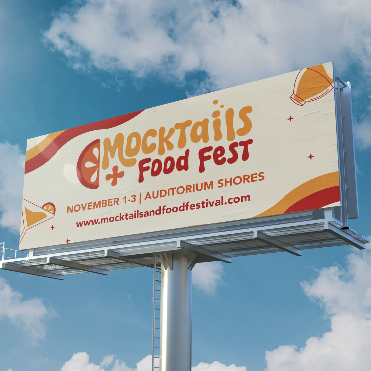
I challenged myself to push the concept further by rethinking the entire brand experience. I renamed the event Mocktails & Food Fest to give it a punchier, more memorable identity. I also created a new visual system including a logo, bolder color scheme, modern typefaces, custom icons, and a more elevated look and feel that better matched the vibrant, health-conscious audience the festival aimed to attract.
This redesign allowed me to approach the project with fresh eyes and refine every design decision—from voice and visuals to layout and hierarchy—resulting in a brand that feels cohesive, polished, and purpose-driven.
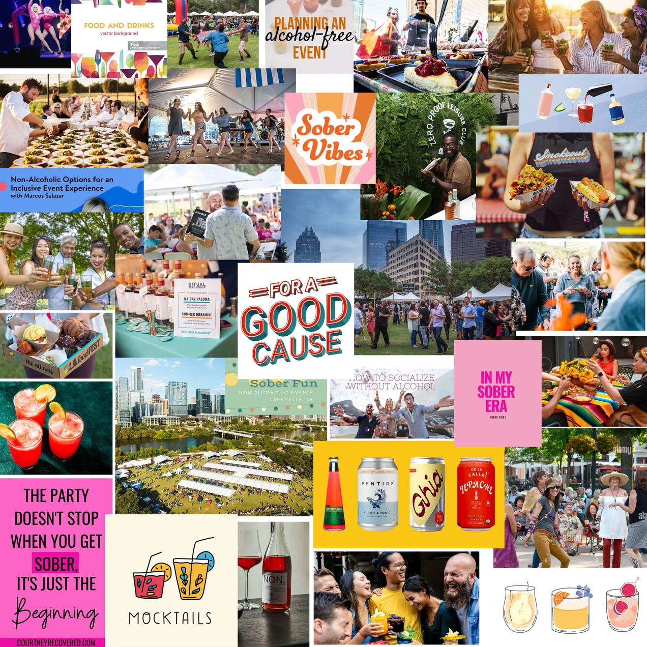
To create a compelling and authentic festival concept, I conducted research on Austin's culinary scene, current trends in alcohol-free beverages, and successful food festivals. I explored the rising popularity of mocktails and how they fit into the city's vibrant food culture. I also created a mood board to gather visual inspiration.
Key insights from my research included:
The inspiration for the Mocktails & Food Fest logo came from a striking image of a blood orange mocktail. The deep, citrusy hues and the refreshing essence of the drink immediately sparked a vision for the brand identity. I wanted the logo to capture the same invigorating and vibrant feeling that a chilled, handcrafted mocktail delivers.
As I sketched ideas, I envisioned a mocktail glass and incorporated a fruit wedge to enhance the sense of freshness and zest. The fruit wedge, a classic garnish in many non-alcoholic beverages, symbolizes the crisp, revitalizing experience that the festival aims to offer.
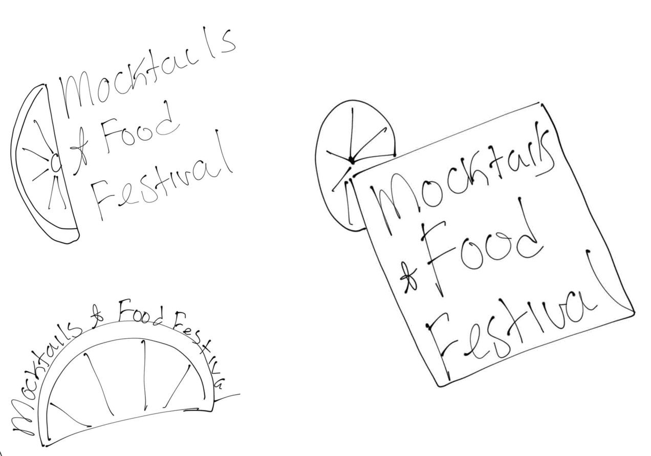
During the digital sketching phase, I explored multiple logo variations to visually communicate the festival's lively and refreshing essence. Each option incorporates a bubbly typeface, reflecting the effervescence of a freshly poured mocktail.
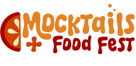
I went for option 4 with a couple of updates.
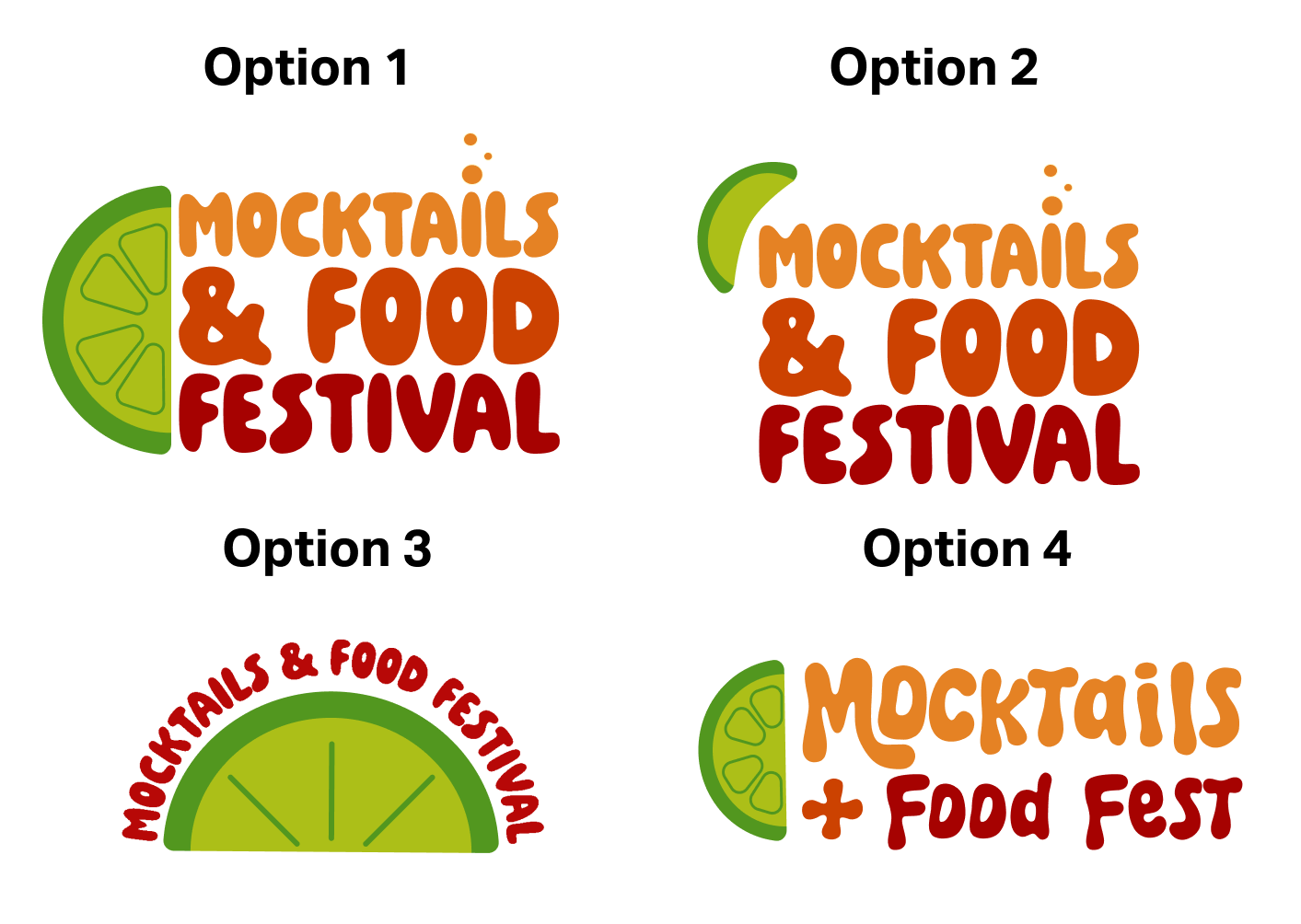
The final Mocktails + Food Fest logo captures the playful and refreshing spirit of the festival. Key features include:
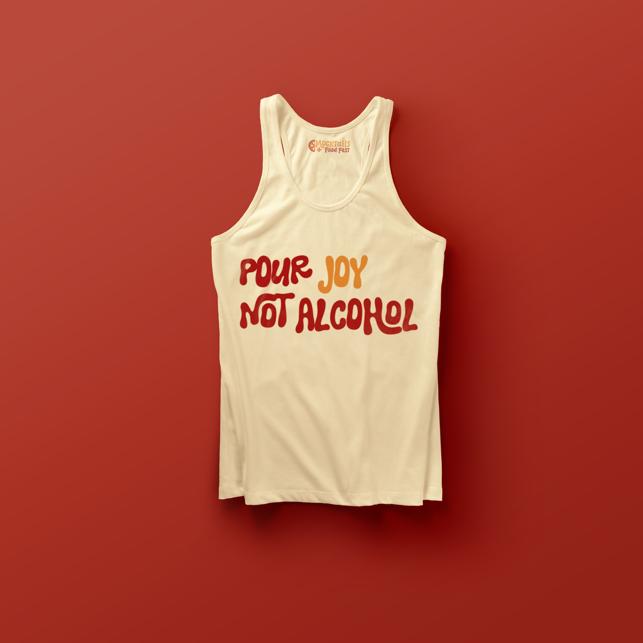
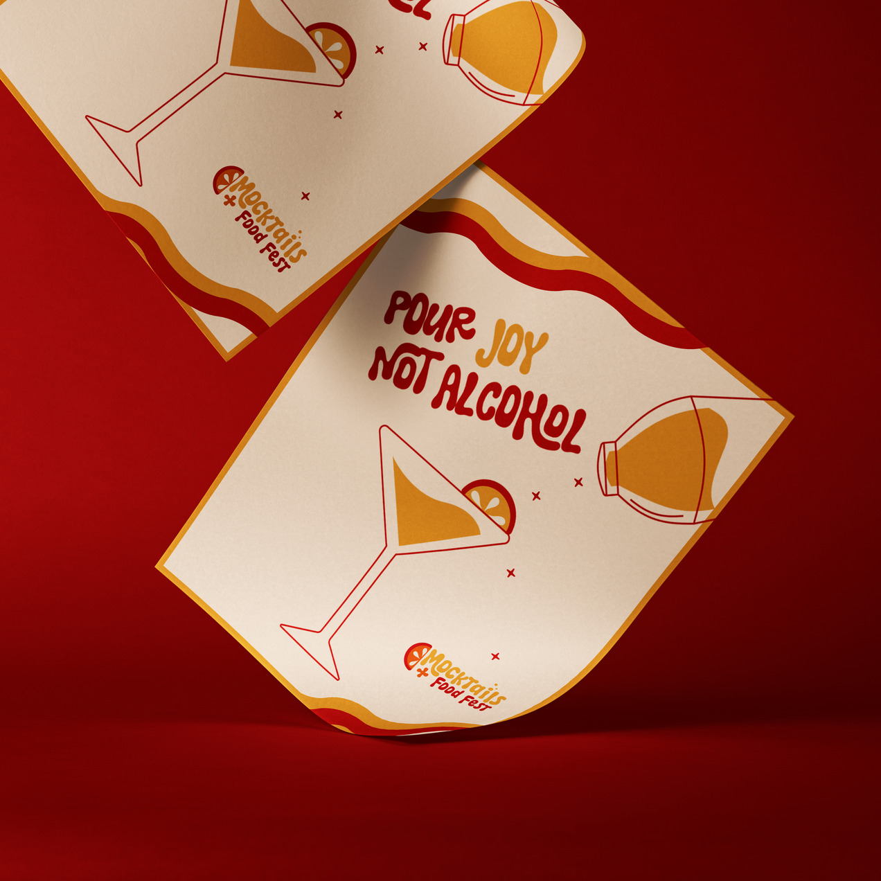
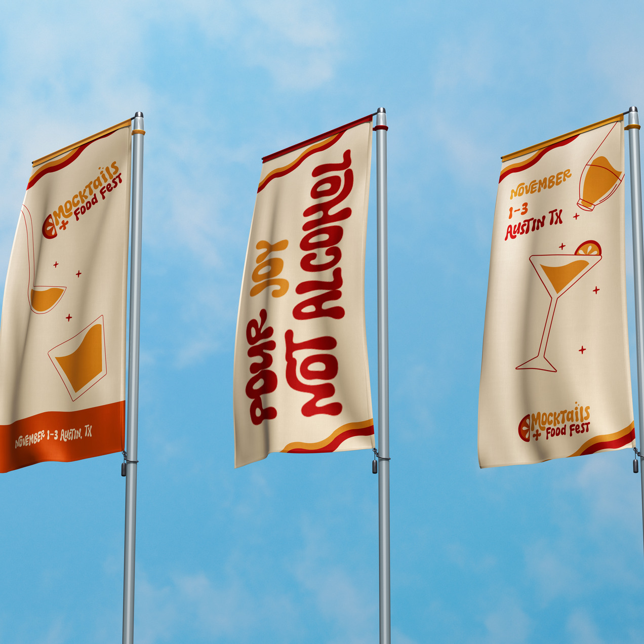
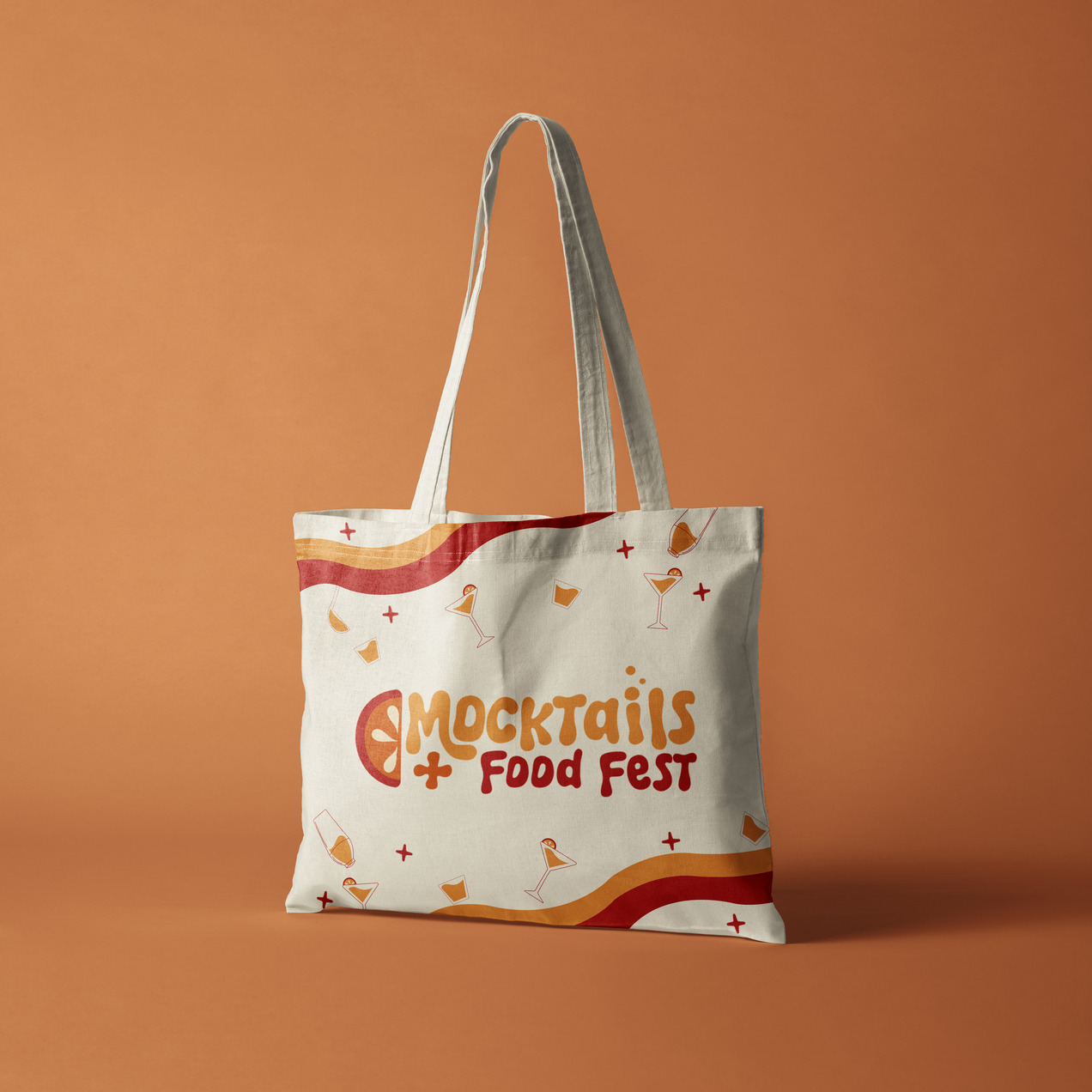
The logo ties everything together, embodying the message of “pour joy, not alcohol” in every detail.
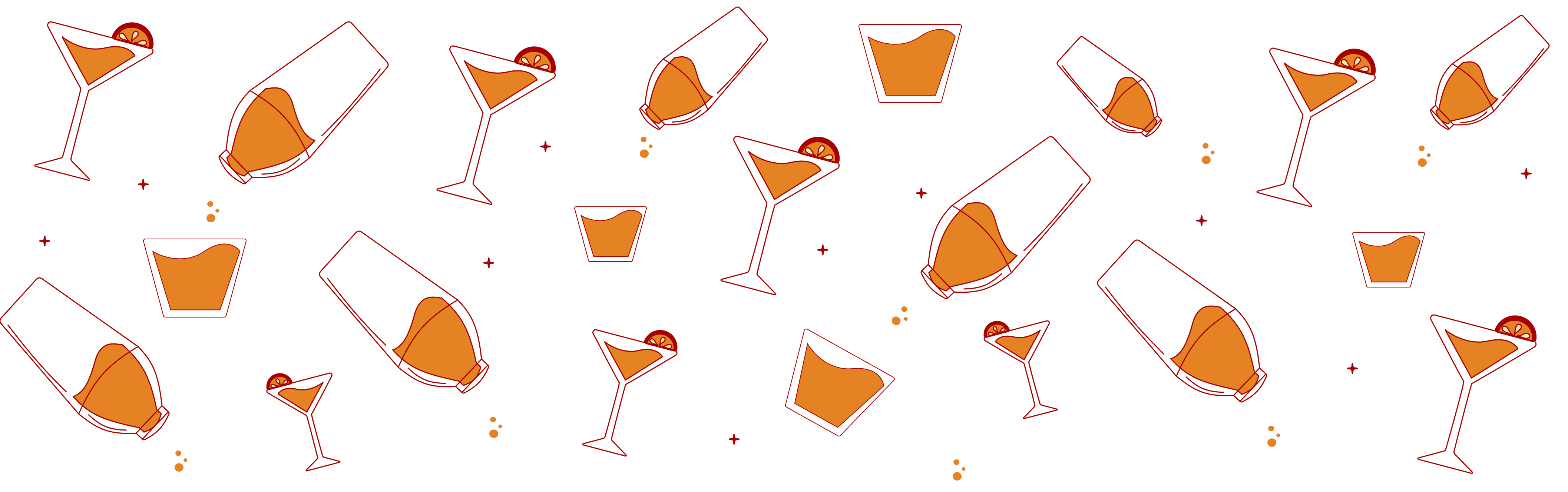
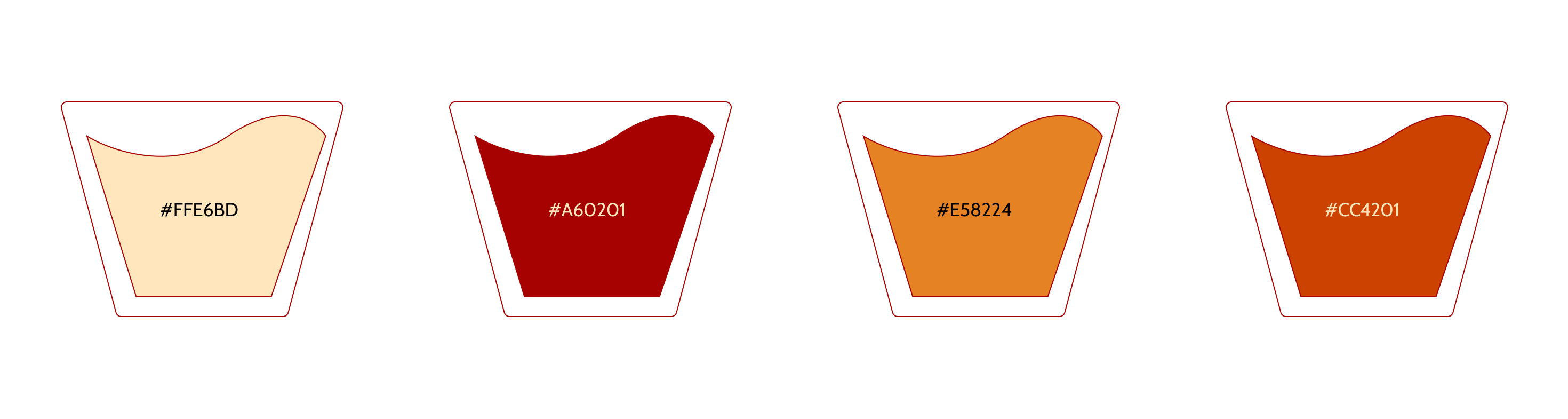
Vibrant color palette using oranges and reds to represent fruity drinks and bold flavors.
Hand-drawn lettering to convey a casual, fun atmosphere.
I wanted to create custom illustrations to make sure they were up to brand standards.
Through this project, I learned the importance of fully integrating a brand's identity into every design element. I challenged myself to think about how I could incorporate the brand as much as possible, from the smallest illustration details to the overall color choices. The concept of "pouring joy, not alcohol" truly influenced me throughout the process, pushing me to create a fun and cohesive visual language that reinforces the festival's spirit in every aspect. This project also reaffirmed my love for branding and festival design, and I would love to one day be a designer for a festival, bringing unique visual experiences to large-scale events.