
Amplitude is a conceptual online platform designed to make learning instruments fun, fast, and addictive—taking inspiration from rhythm games like Guitar Hero. It blends music education with game mechanics, turning practice into play.

Amplitude is made for curious, creative people ages 13–35 from all walks of life. They may have bought an instrument once but never stuck with it. They’re not trying to master classical music—they want to learn how to play what they love: punk, pop, rock, or indie.
They value self-expression, fun, and learning by doing. They might be intimidated by traditional methods, but they’re excited to learn in a way that feels playful, personal, and modern.

19 · Austin, TX
College Student
Middle ClassRubi owns a guitar but never learned to use it. She loves music and wants to jam like her favorite artists, not read sheet music. She’s looking for a fun, no-pressure way to finally play the songs she loves.
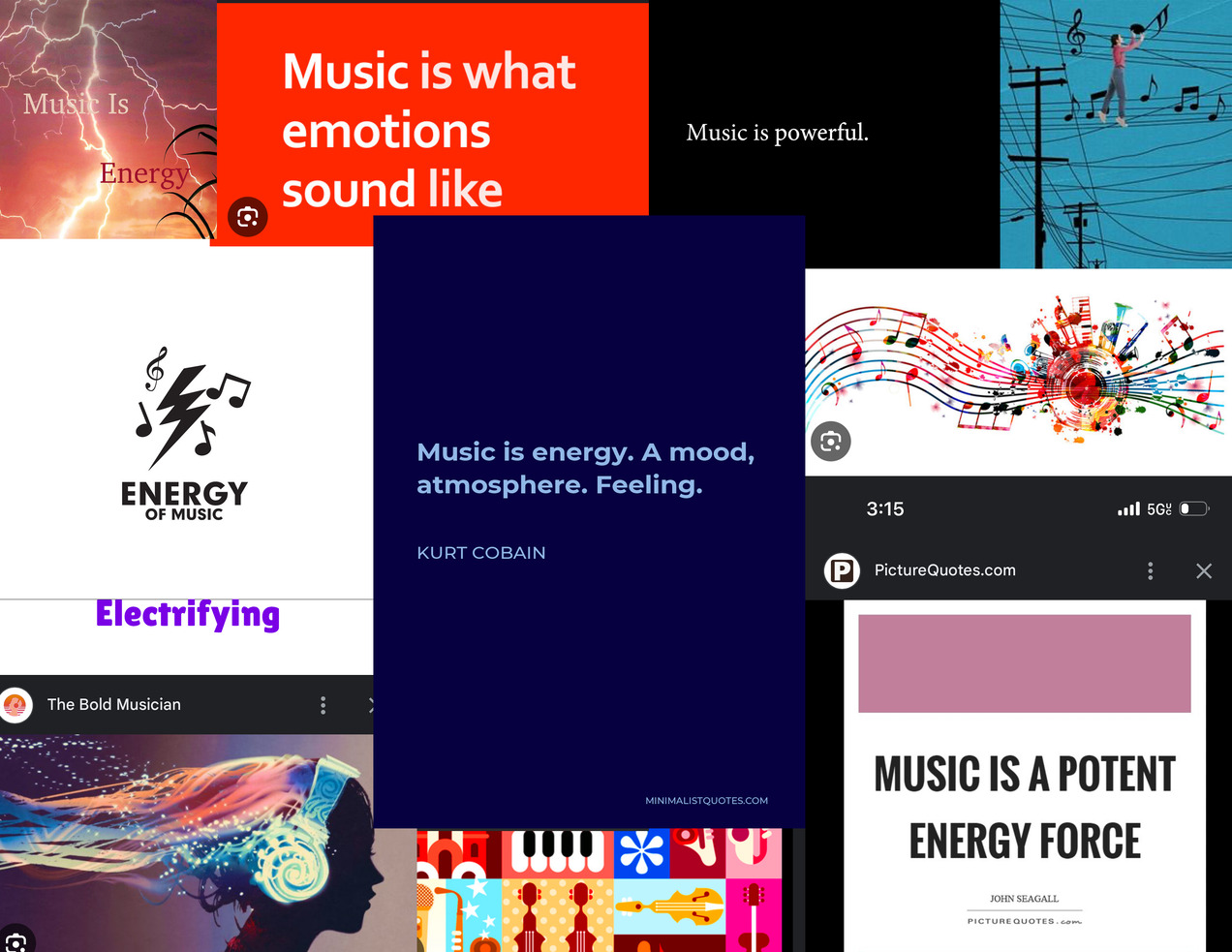
To shape the creative direction of Amplitude, I began by building a mood board that explored how music connects to emotion, energy, and identity. Key themes emerged:
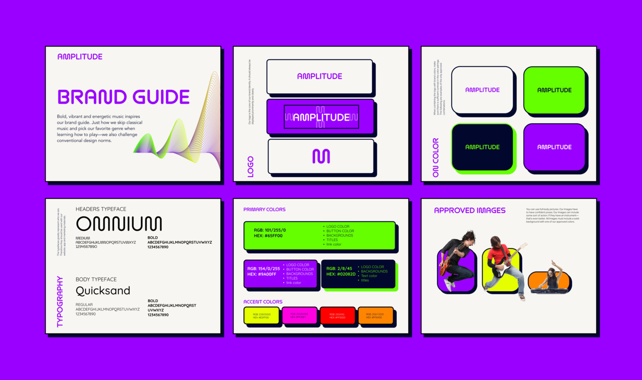
Amplitude means the strength or intensity of a wave. In sound, it's what makes music loud. I chose this name because it reflects the energy, boldness, and confidence I want users to feel. The concept “Music is Energy” became my anchor point.
To further explore the idea, I created a word map using “Music” as the core theme. This helped generate potential directions and shape the overall tone.

The visual identity of Amplitude is inspired by energy, youth culture, and non-traditional learning. Just like users break away from classical music rules, the branding rejects conventional design norms. I embraced a bold brutalist style that feels electric, chaotic, and confident—just like picking up a guitar and learning your favorite song for the first time.
Full brand guide available here.
Mockups showcasing the Amplitude platform across different devices.
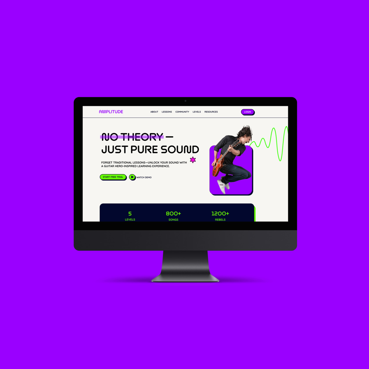
Website Interface
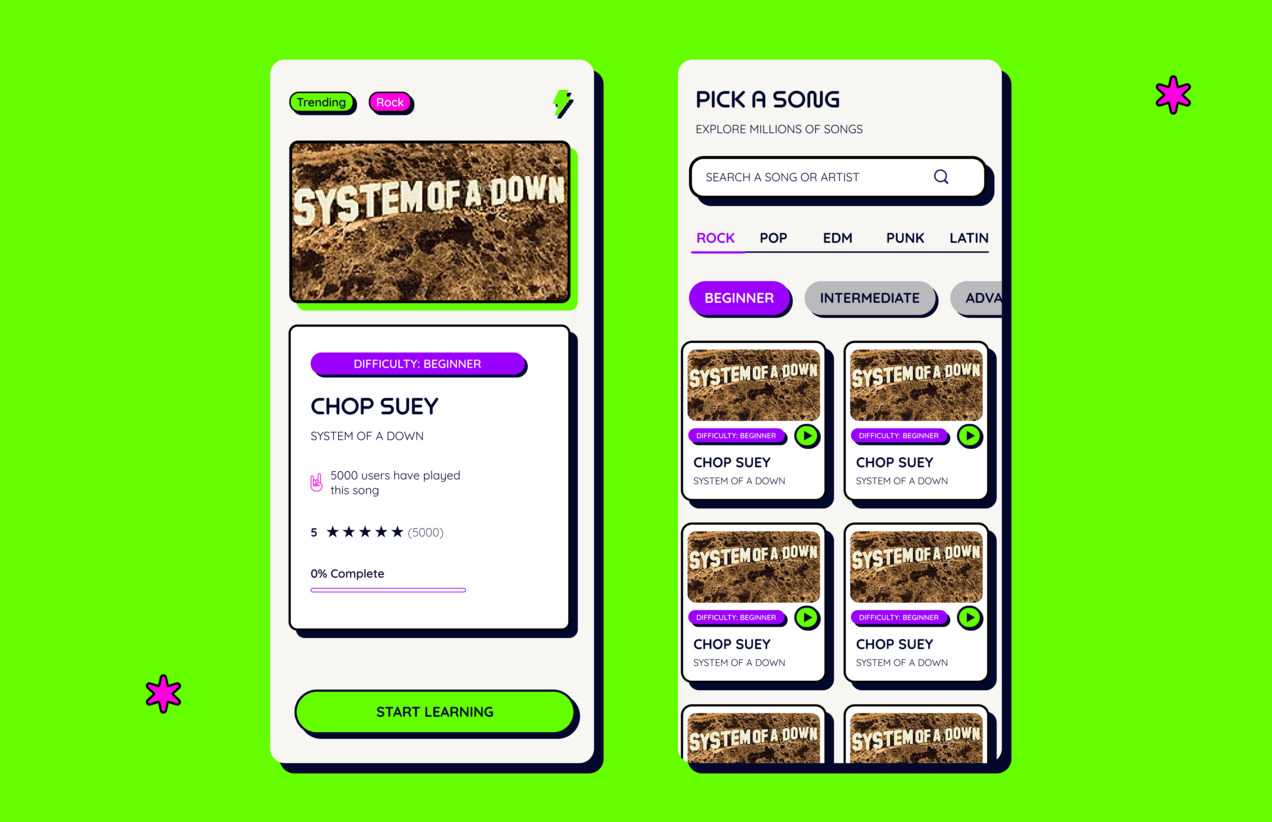
Mobile App Interface
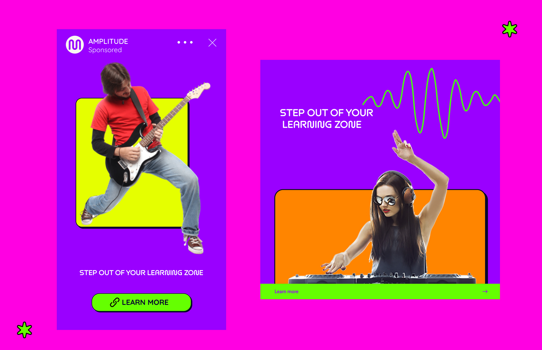
Social Media Concept
Amplitude aims to make learning engaging with features like:
Designing Amplitude challenged me to think beyond aesthetics and truly consider how branding can empower users. I learned how to blend visual storytelling with user motivation—creating a rebellious, high-energy identity that feels fun and inviting, especially for beginners who might otherwise feel intimidated by music education.
This project pushed me to stay intentional with my design choices—from typography and layout to color theory and tone of voice. I also deepened my skills in brand system design and digital product thinking by creating a cohesive experience across web, app, and social platforms.
Most of all, I walked away with a deeper appreciation for how design can break down barriers, inspire confidence, and make learning feel like play.