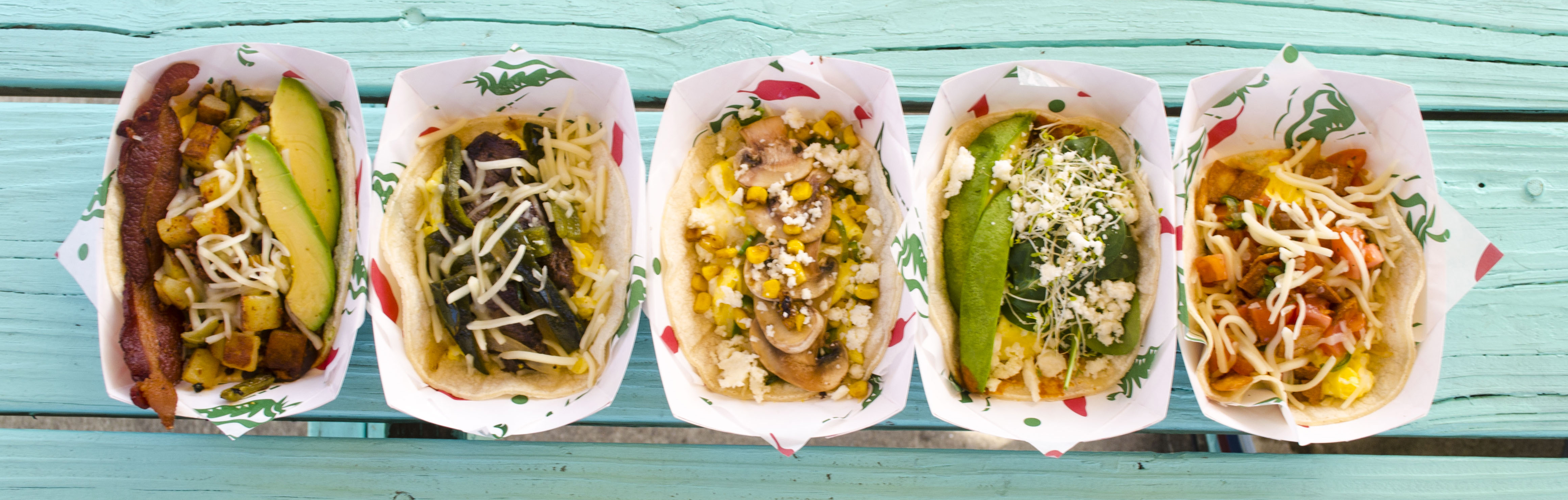
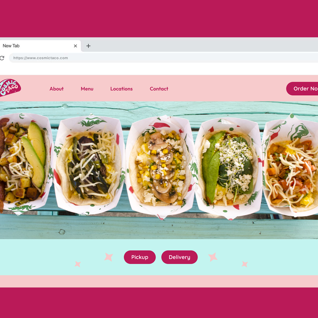
Cosmic Taco is a real Austin-based taco spot known for its out-of-this-world Tex-Mex flavors. I created a rebranding concept that celebrates its funky name with a bold, psychedelic twist—blending 60s cosmic aesthetics, Mexican vibrancy, and Austin's laid-back taco culture into one fun, groovy identity.

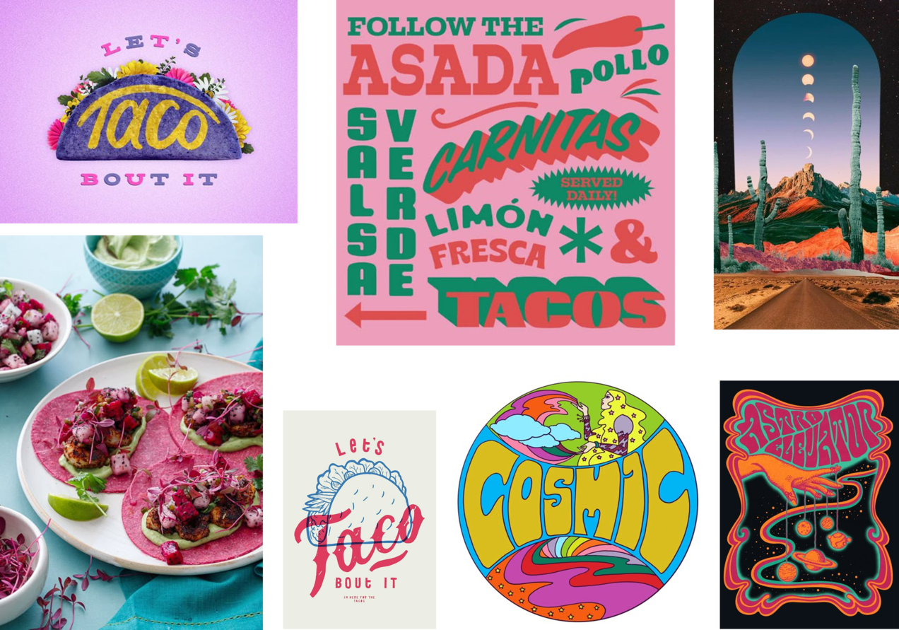
To reimagine the brand, I immersed myself in:
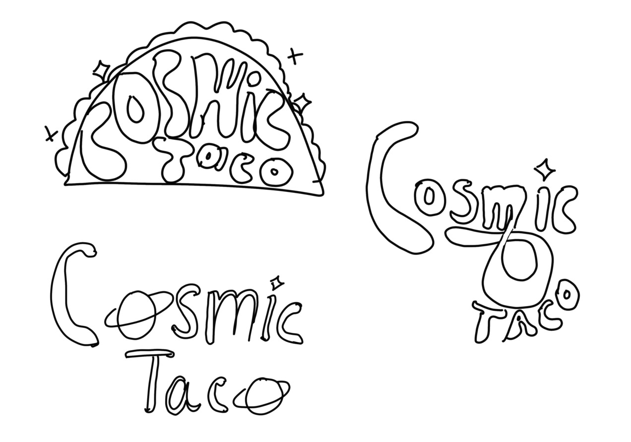
The naming of Cosmic Taco opened the door to endless playful possibilities. I wanted the logo to reflect the brand's quirky energy and outer space theme while staying grounded in its roots as a taco joint.
Concept 1: Groovy Type with a Star "i": This version used a psychedelic 60s-inspired font, with bubbly, wavy letterforms full of movement. I replaced the dot in the "i" with a star to emphasize the cosmic vibe.
Concept 2: Planetary "o"s: In this iteration, both "o"s in "Cosmic" and "Taco" were replaced with Saturn-style planet icons—creating instant space recognition and making the logo feel like it's orbiting around flavor.
Concept 3: Words Inside a Taco Shell: For this version, I experimented with a taco-shaped container where the words "Cosmic Taco" were wrapped snugly inside a stylized taco shell illustration.
After exploring multiple directions in the ideation phase, I decided to further develop two of my favorite concepts:
I brought these sketches into the digital space to experiment with color palettes, typography, and layout. I tested different typefaces—ranging from retro and groovy to bold and modern—to see how they affected the tone and personality of the logo.
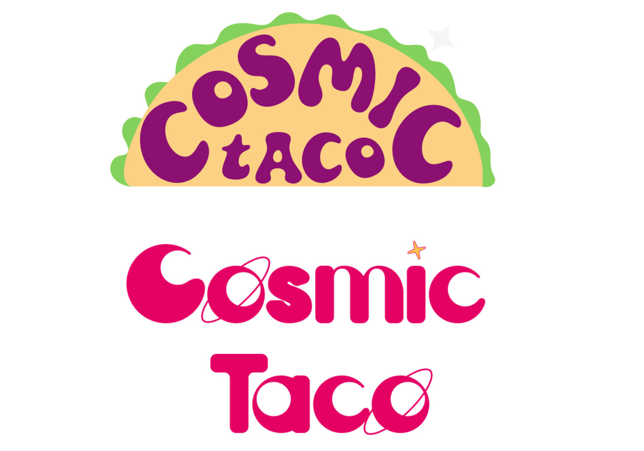
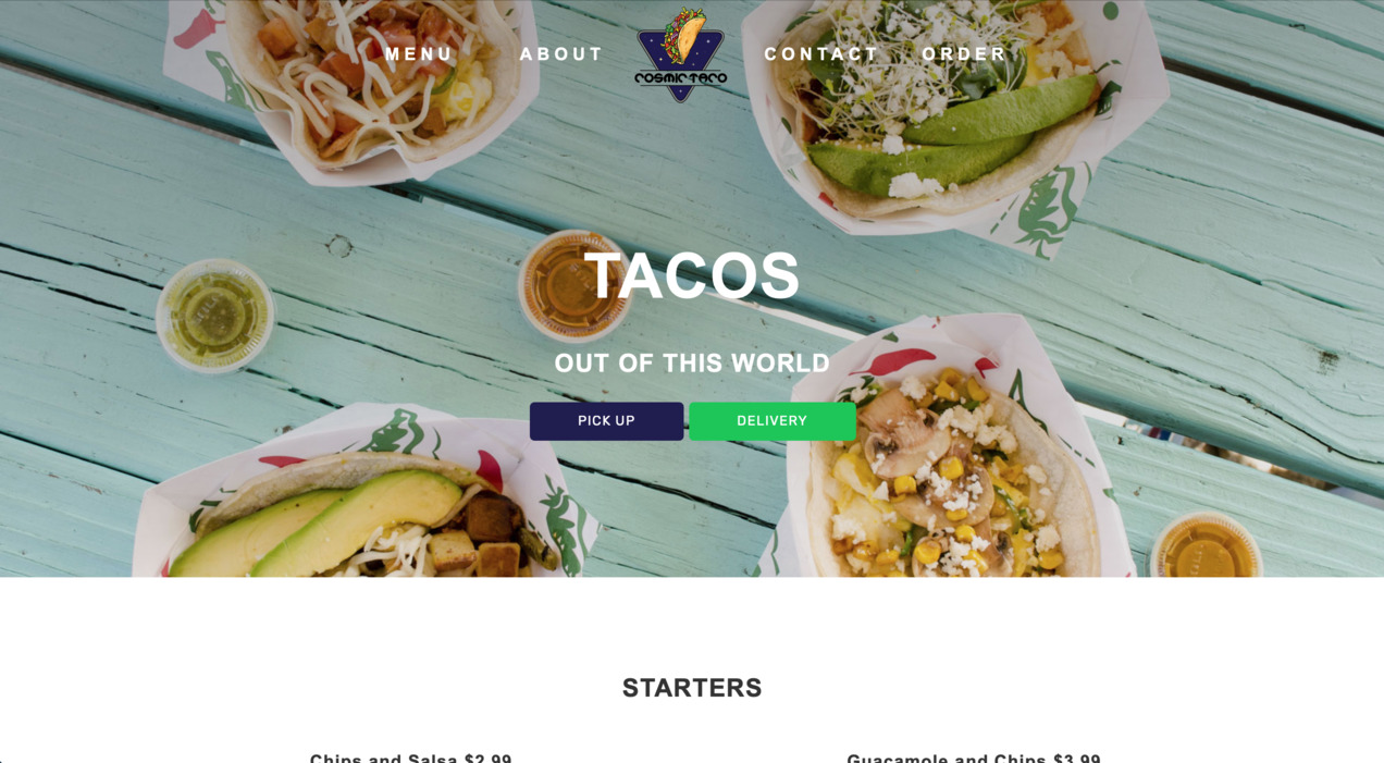
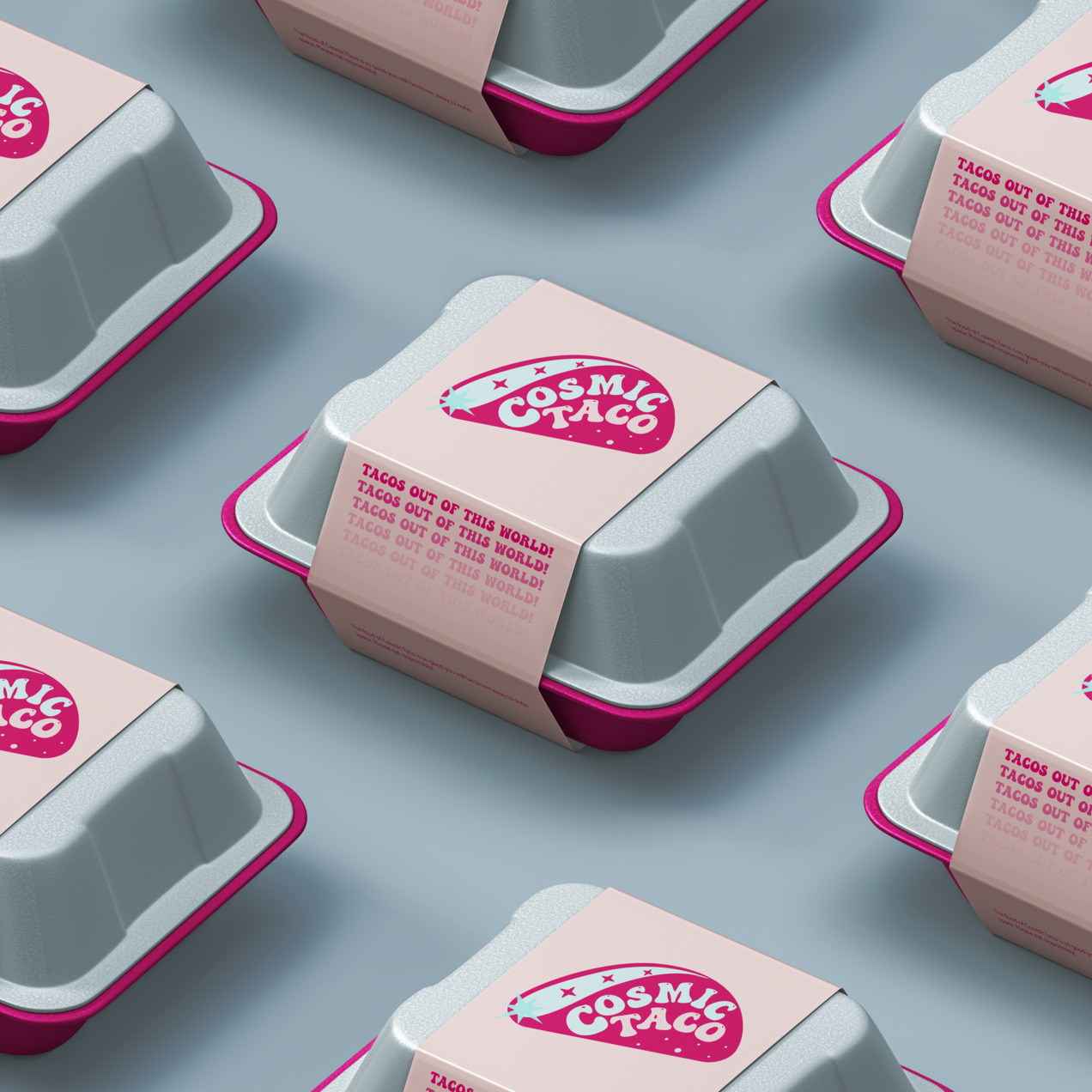
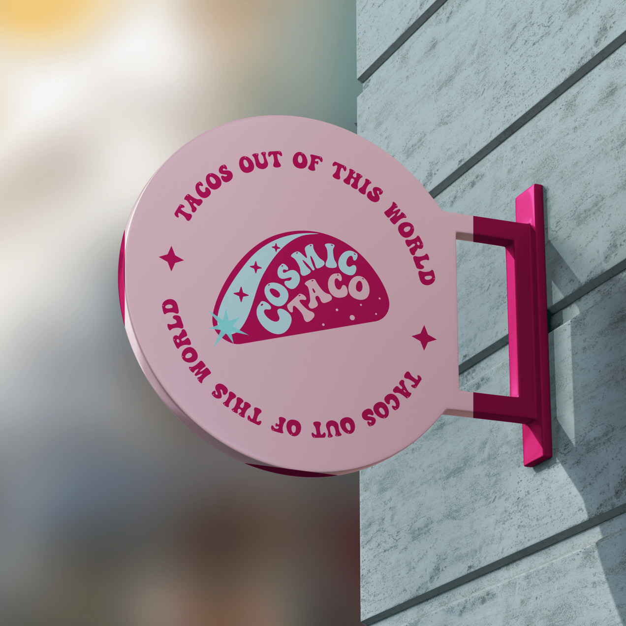
The final logo captures the playful, out-of-this-world vibe of Cosmic Taco while grounding it in a bold, approachable style. I chose the concept where the name Cosmic Taco is framed inside a stylized taco shell—a shape that's instantly recognizable and full of personality.
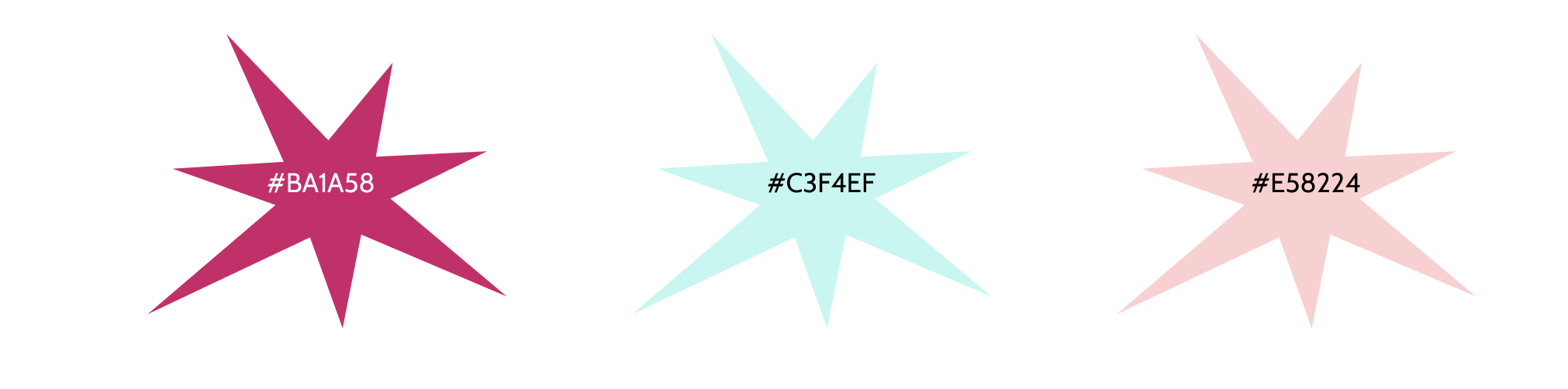
Together, these colors reflect the heart of Cosmic Taco: bold, vibrant, and unapologetically fun. The mix captures both the flavor-packed experience of Mexican street food and the whimsical, spacey essence behind the name.
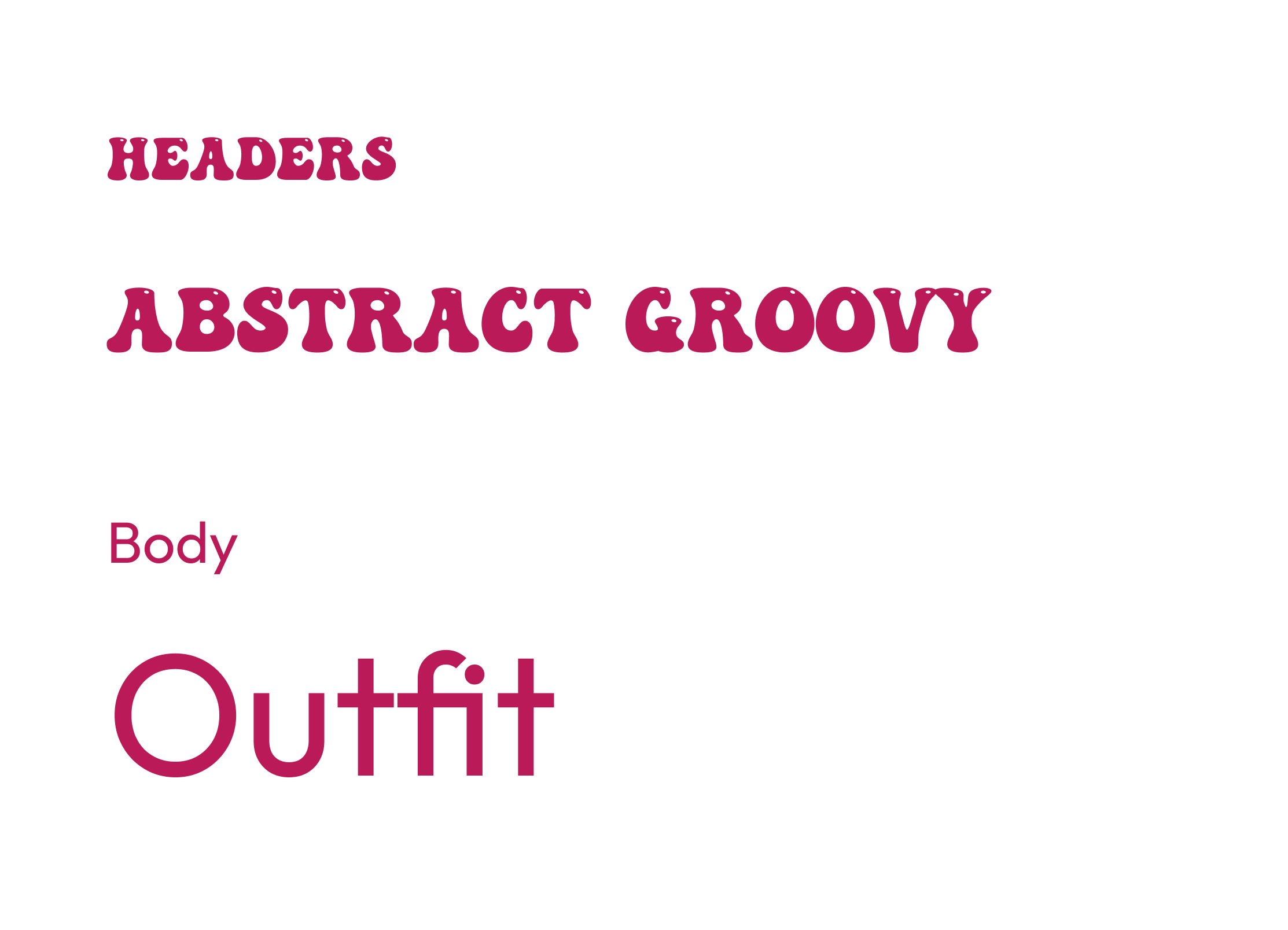
I selected a bold, chunky typeface that feels grounded, confident, and a little groovy.

This project was a reminder of how much I love building brands with big personality. Reimagining Cosmic Taco allowed me to fully explore how design can be both strategic and playful—how something as simple as a taco can tell a larger story about culture, fun, and creativity.
This project strengthened my skills as a visual designer and storyteller. It was a chance to not just create a logo, but to bring a full cosmic universe to life—one taco at a time.