Amplitude
I served as a visual designer for Amplitude, a new music educational platform offering video courses and interactive exercises. I established their visual identity by creating a comprehensive brand style guide to unify their products and components.
Project Scope
- Illustration
- Design Concept
- Typographic Identity
- Color Palette
- Design Tokens
Discovery
Who was I designing for?
- Primary audience of age 13-35
- Middle Class
- All genders, races and ethnicities
- They don’t want to learn classical/academic music. They want to learn how to play an instrument from their favorite genre.
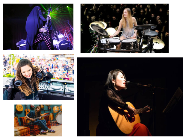
Possible feelings I wanted to express
- Energy
- Bold
- Fun
- Rebellious
- Confidence
Product Features
- Beginner to advanced online courses
- You learn on your own pace with a similar style such as “Guitar Hero”
- Slow/speed songs based on your preference
- You can pay extra to have teachers that are famous in the music world on all the popular genres. They can be with you as you practice and give you feedback online.
- Record your classes to hear back your progress
In order to come up with the concept, I had to make a mood board to get inspiration.
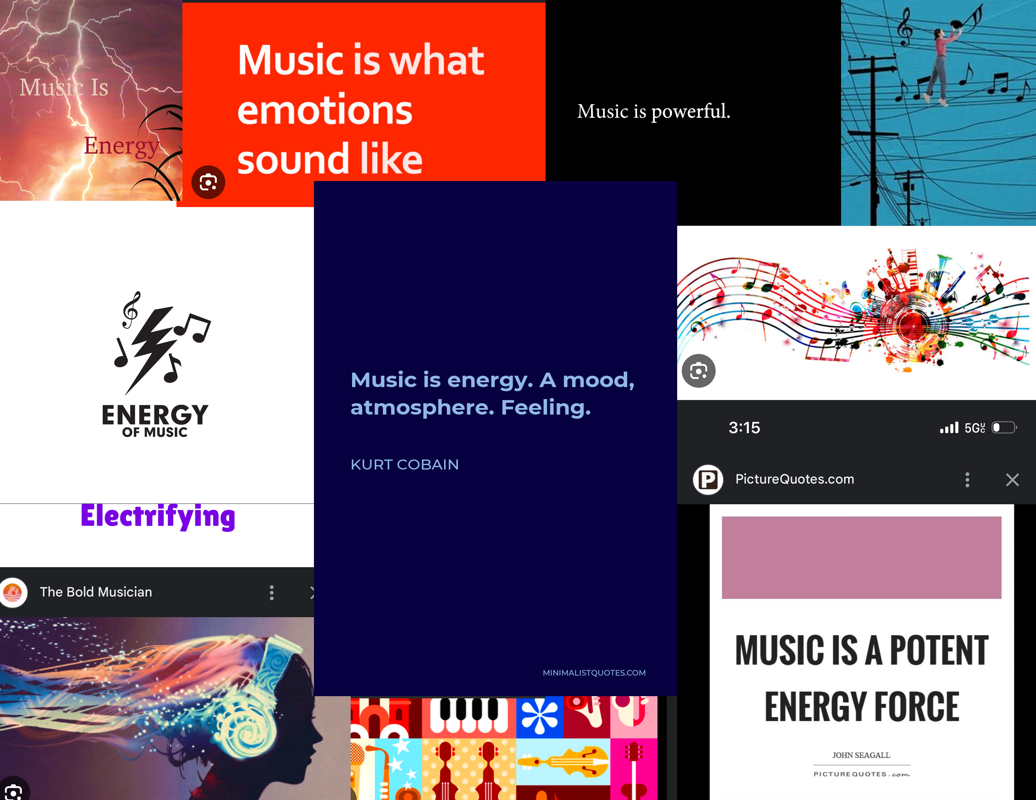
I also did a word map with the word "Music".
Possible Concepts
- Music is Energy
- Music is a strong energy force
- Music is powerful
Company's Name
Amplitude
Why Amplitude? Amplitude = The greater the amplitude, the louder the sound. I went with Music is Energy as my concept. I felt that I wanted to demonstrate how loud and rebellious our users could be while achieving their goals.
Brand Guide
The concept would be a brand guide that would displayed as a single paged website.
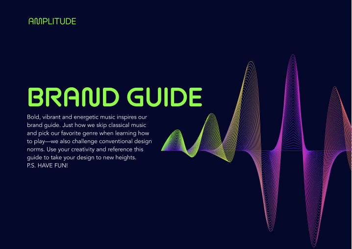
Hero
The hero would show the title of the page as well as a description of who Amplitude is for.
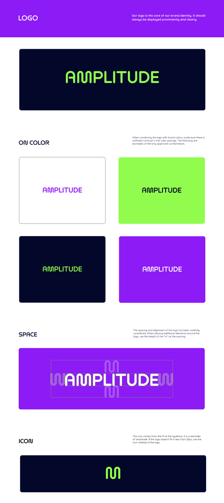
Logo
I wanted to keep the logo minimalistic while displaying a wave that symbolized the word "Amplitude". Also I wanted to show what backgrounds were approved, the spacing around the logo, and the icon.
Typography
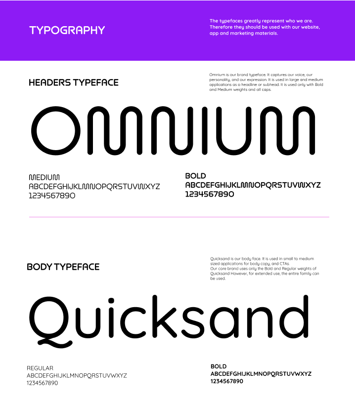
The typefaces that I wanted to use had to have some sort of uniqueness. The "M" looks like a wave that was perfect for the waves that I wanted to incorporate throughout the brand. Both typefaces have descenders and ascenders that are rounded in the corners which look similar and makes it look more unified.
Typography Continued
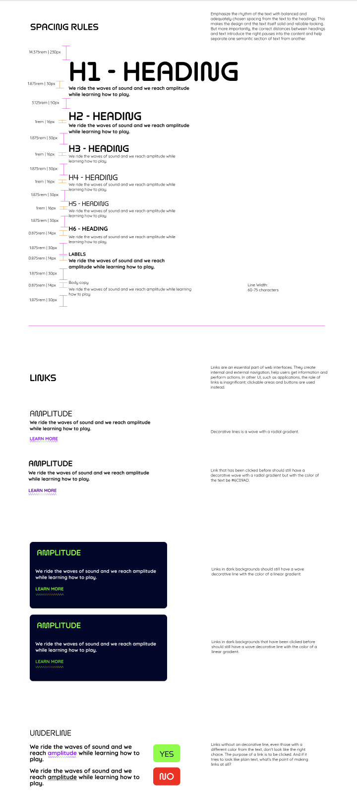
The continuation of the typography section includes the spacing rules for each header and paragraphs. It also includes a section regarding how links should behave.
Color
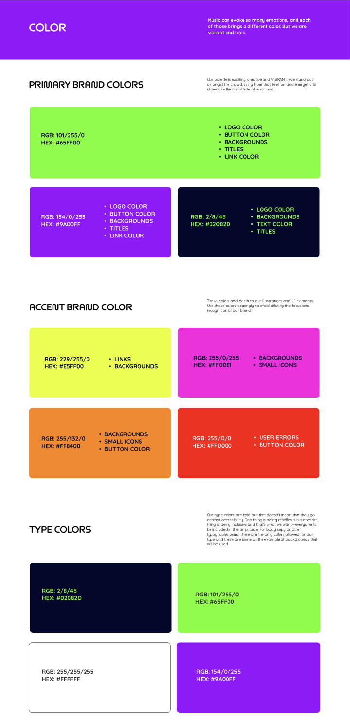
The colors that I used reflect the emotions I wanted users to feel. The emotions are Bold, Energetic, Fun and Rebellious. This section also talks about how to use the colors.
Buttons
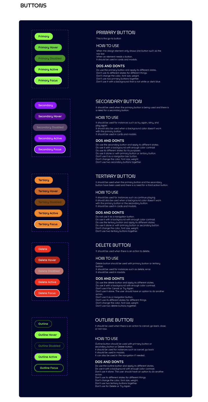
The buttons had to be rounded and use the brand colors. I also talk about how they behave and how to use them.
I only added a few sections to show the brand guide. If you would like to view the entire thing, check it here.